Progress bar
Overview
A progress bar provides feedback about the duration and progression of a process. Progress bars can either be used to inform the user about how long a process will take or serve as a affirmation that the process is still running and the user’s action or request is being executed.
When to use
- When a process is (or could be) taking a considerable amount of time which the user might interpret as if the process failed to execute.
- The process can be described with quantitative information (percentage).
- To convey that data is being requested, transferred or processed.
When not to use
- When the progress bar will be replaced by a minor user interface element once loaded, use skeleton states instead
- When manual user actions are required to progress, use a progress indicator instead
Live demo
Variants
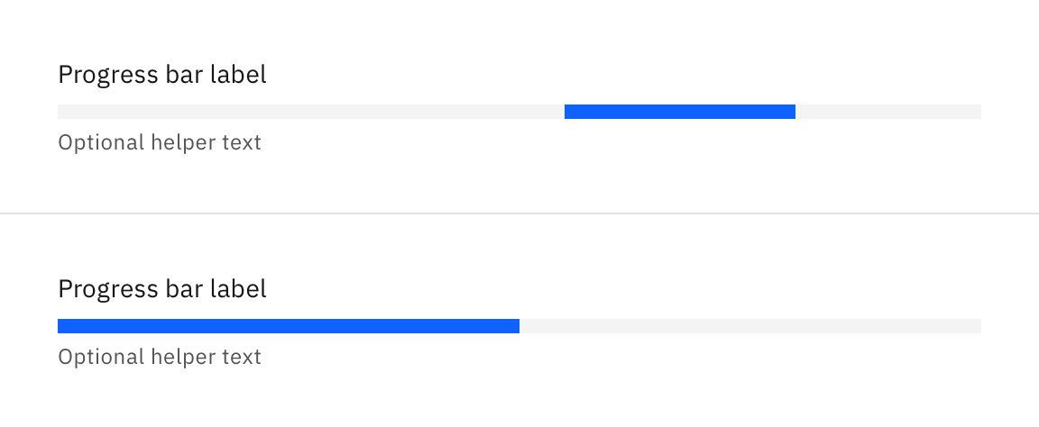
A progress bar can either be indeterminate or determinate. The indeterminate variant is visualized as a track on which a bar is moving along in constant speed, repeating over time. The determinate variant is visualized as a track on which a bar fills up from left to right representing the progress.
| Variant | Purpose |
|---|---|
| Indeterminate | Use the indeterminate variant when the remaining time is unknown or you don’t have exact information baout the process, but you still want to convey to the user that their request / action / data is being processed at the moment. |
| Determinate | Use the determinate variant when you have exact, quantiative information about the progression. |
Formatting
Anatomy
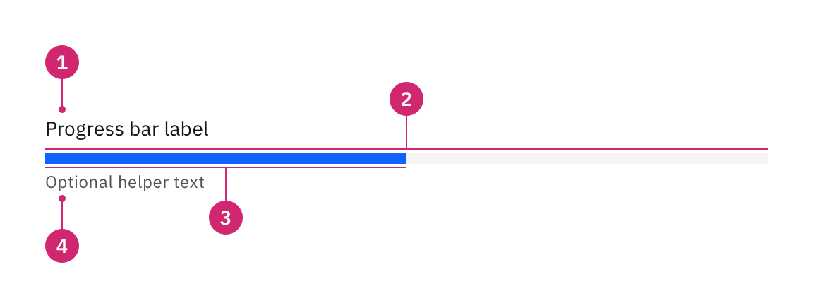
- Heading: Describes what process the progress bar is refering to / visualizing (can be visually hidden).
- Track: The area the bar is moving on. Provides a reference of what the total length / duration of the process will be.
- Bar: Indicates how far the process has progressed so far.
- Helper text (optional): Can be used to convey additional information about the process such as the current step (e.g. “Fetching assets…”), the exact progression (e.g. “42/256 items”), or the estimated remaining time (e.g. “about 3min remaining”).
Sizing
The progress bar’s width / length should be related to the container the loaded content will appear in. However, stretching it too long reduces the readability. Keep the width to a maximum of 6 columns if possible.
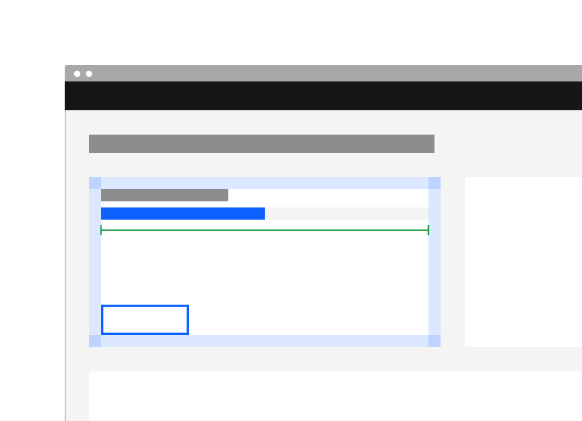
Do stretch the progress bar the entire width of a related element (like a tile in which the content will appear).
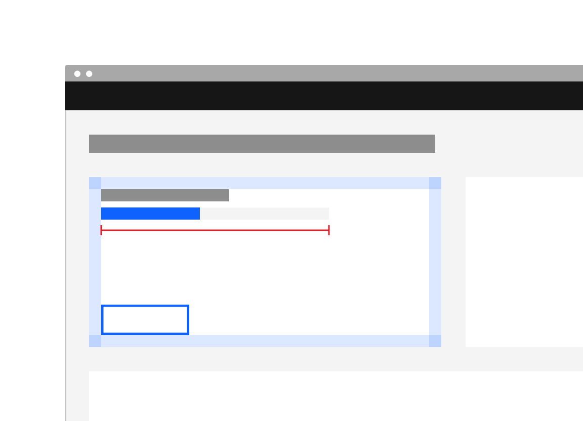
Don't use an arbitrary width for the progress bar.
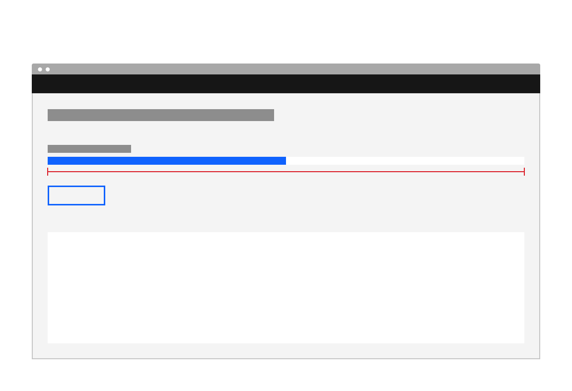
Don't stretch the progress bar over the entire width of the window / application.
Related
Components
Patterns
References
- Accessible Rich Internet Applications Working Group, “progressbar” role, (W3C, 2017)
- Jakob Nielsen, Progress Indicators Make a Slow System Less Insufferable (Nielsen Norman Group, 2001)
Feedback
Help us improve this component by providing feedback, asking questions, and leaving any other comments on GitHub.